betty face
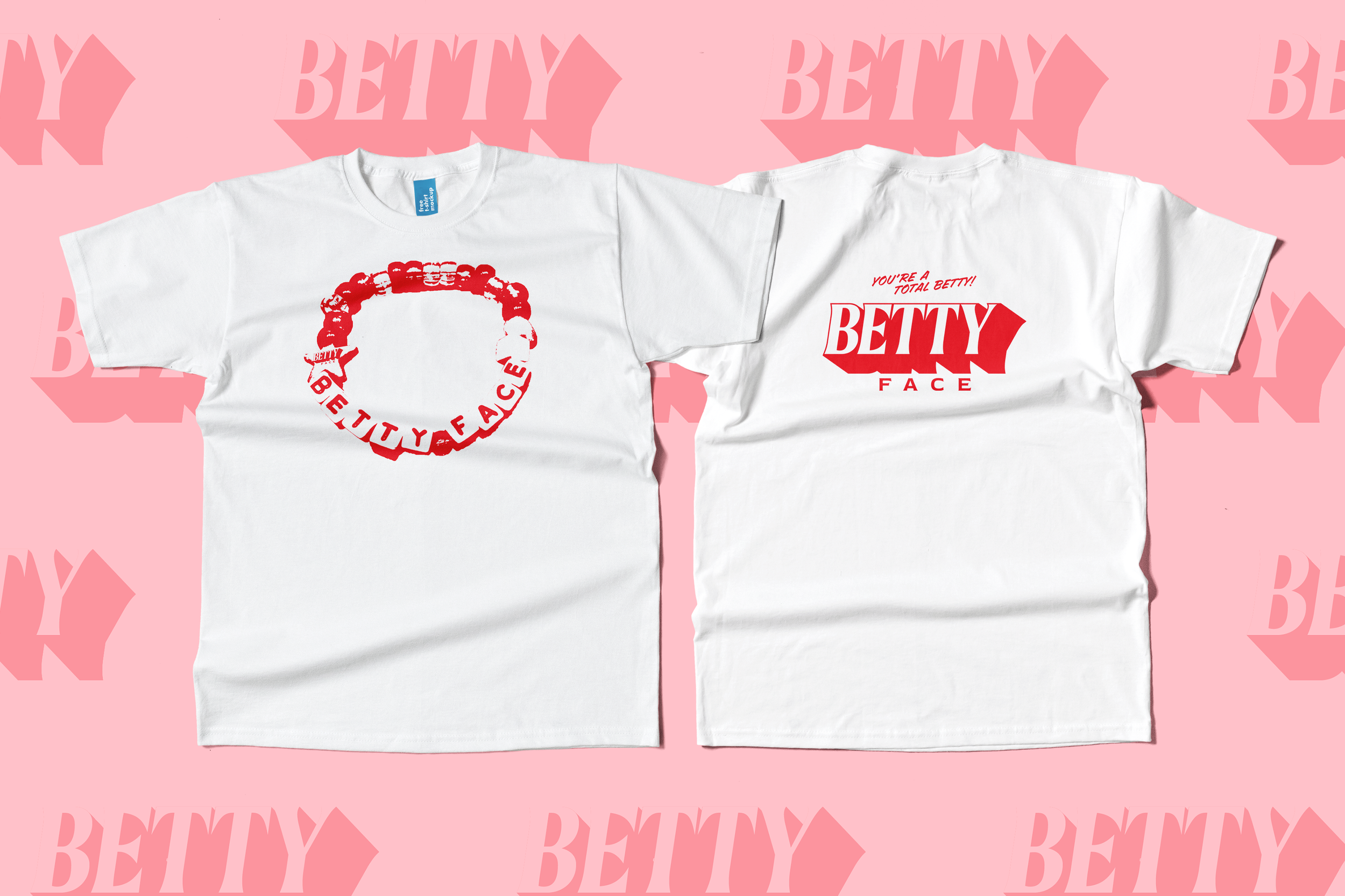
VISUAL IDENTITY / LOGO DESIGN / MERCH DESIGNBetty Face is an esthetician studio in Cincinnati, Ohio specializing in K-Beauty or Korean Skincare. The visual identity embraces girlhood, Asian-American heritage, and a keen sense of what’s cool.
Challenge
The brand utilizes vibrant colors and unique graphic treatments to differentiate it from spa-like competitors.

HERO ILLUSTRATION
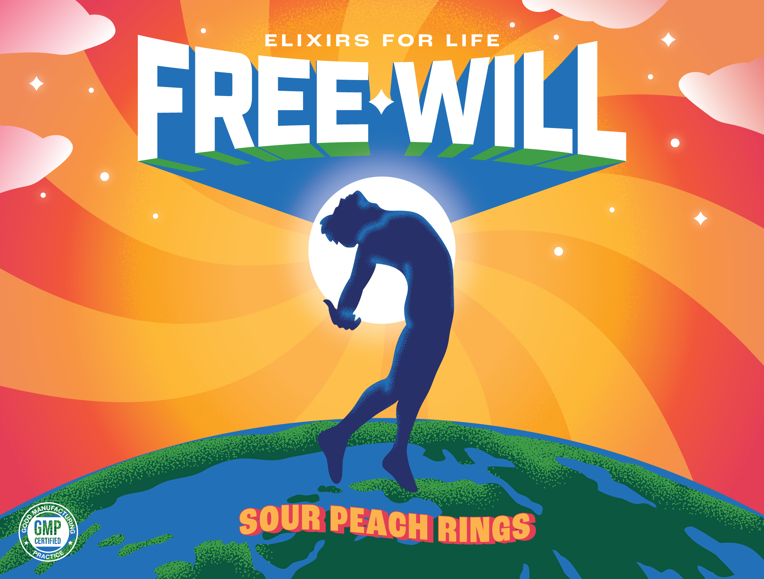
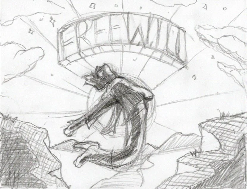
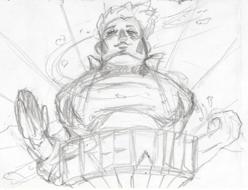
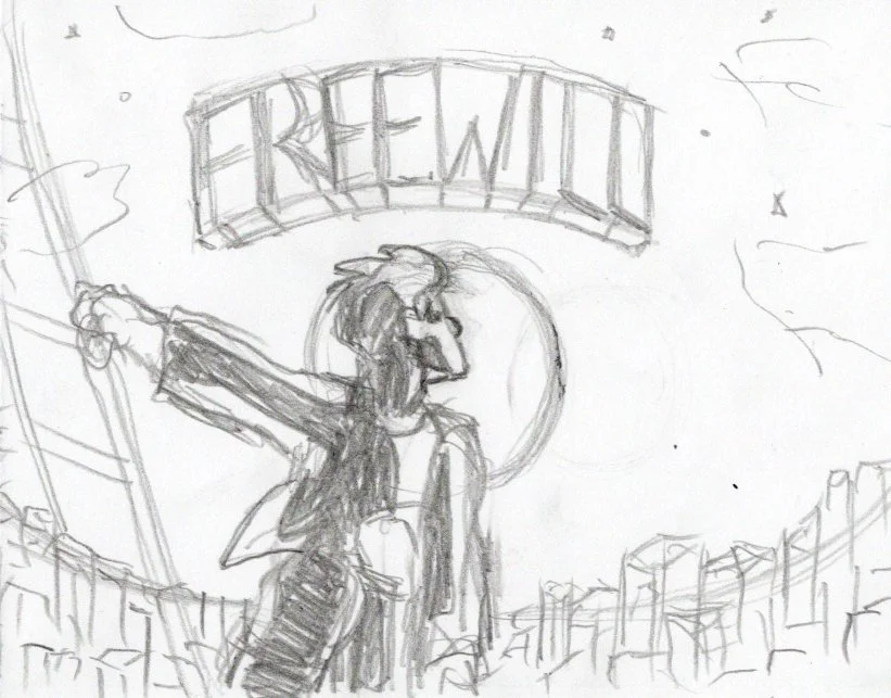
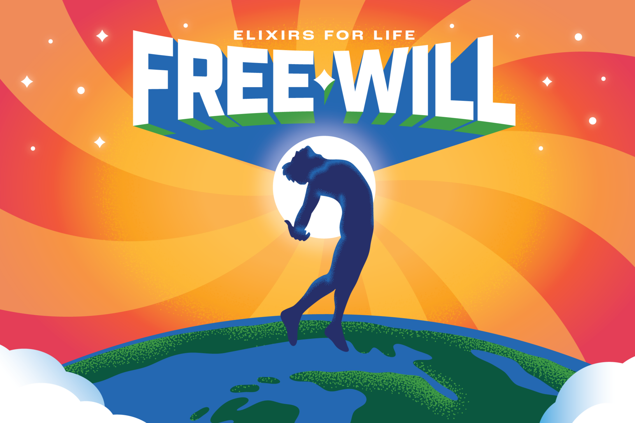
Beginning with hand sketches, the overall composition, environment, figure, and pose were carefully refined and revised to find the perfectly distilled, singular image to communicate the brand’s unique promise: A one-of-one formulation supplement that provides lasting energy, calm focus, and the feeling you can conquer any challenge.
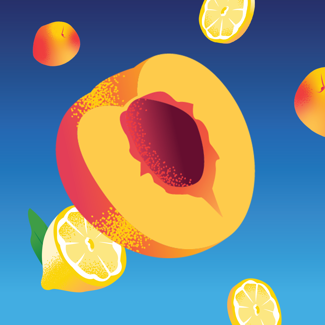
The style of the hero illustration established the look and feel, and informed the development of the rest of the visual identity including colors, typography, and iconography.
BRAND CONCEPT
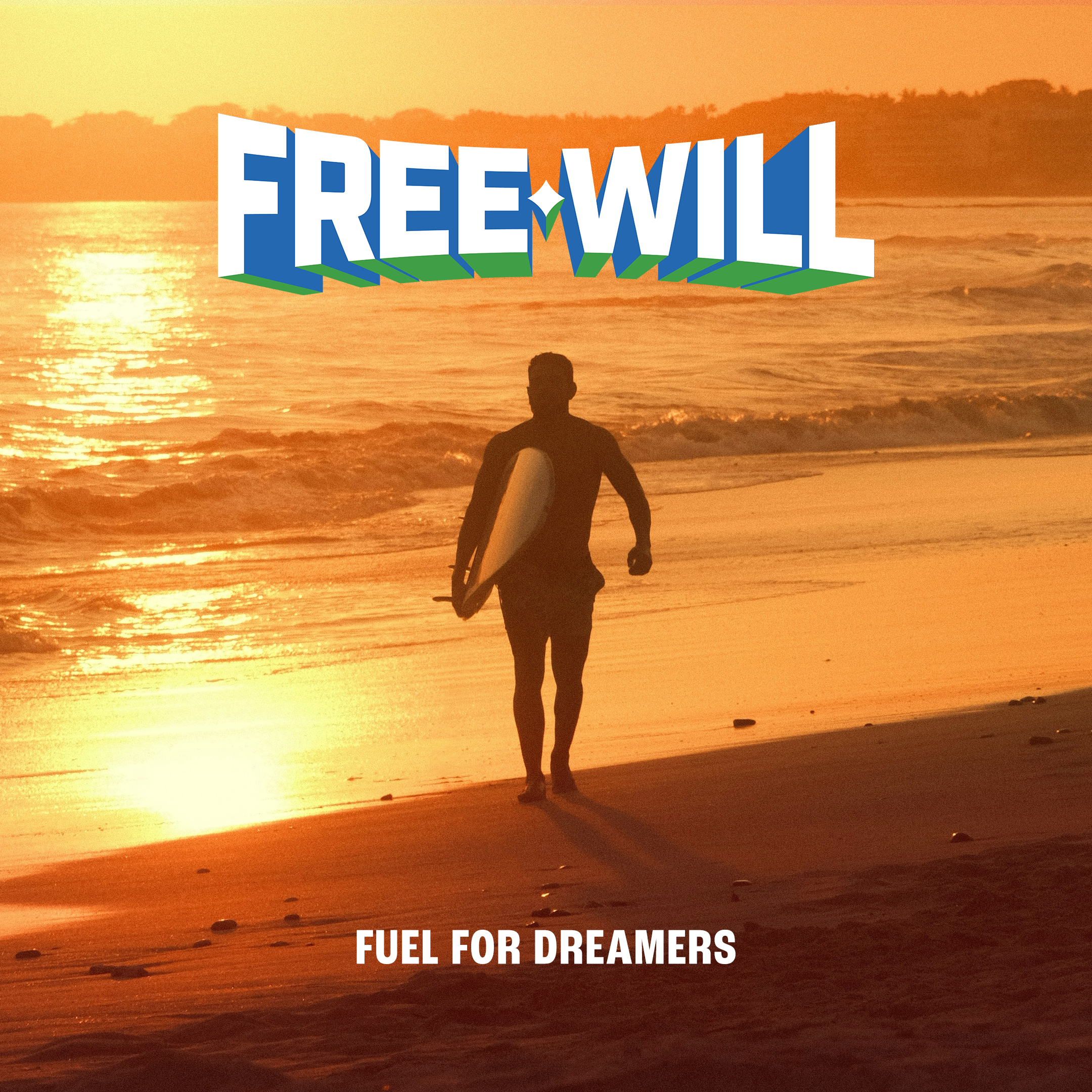
With the approved hero illustration depicting the brand’s mascot “Will” soaring high above the Earth, the brand concept of Free Will being “Fuel For Dreamers” emerged.
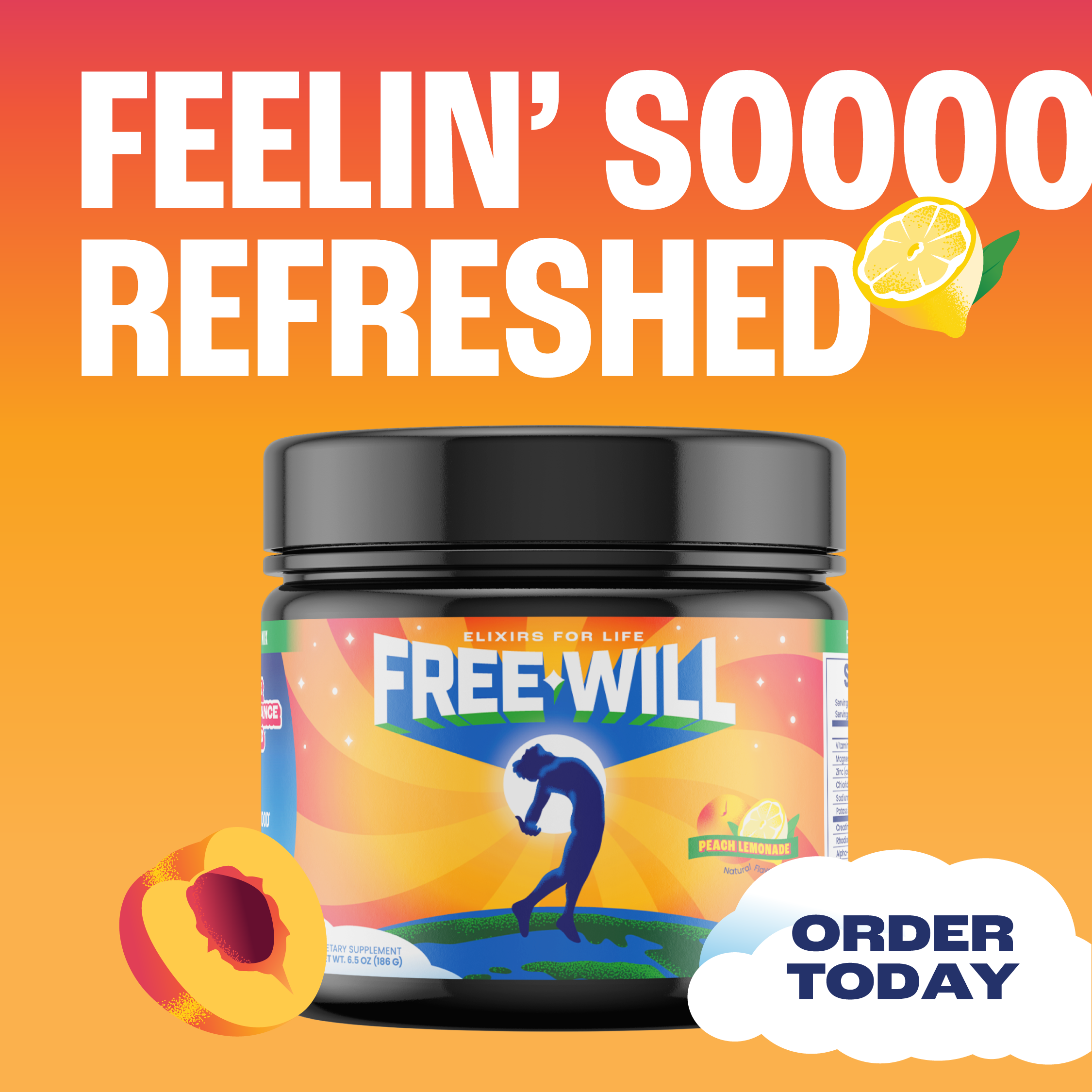
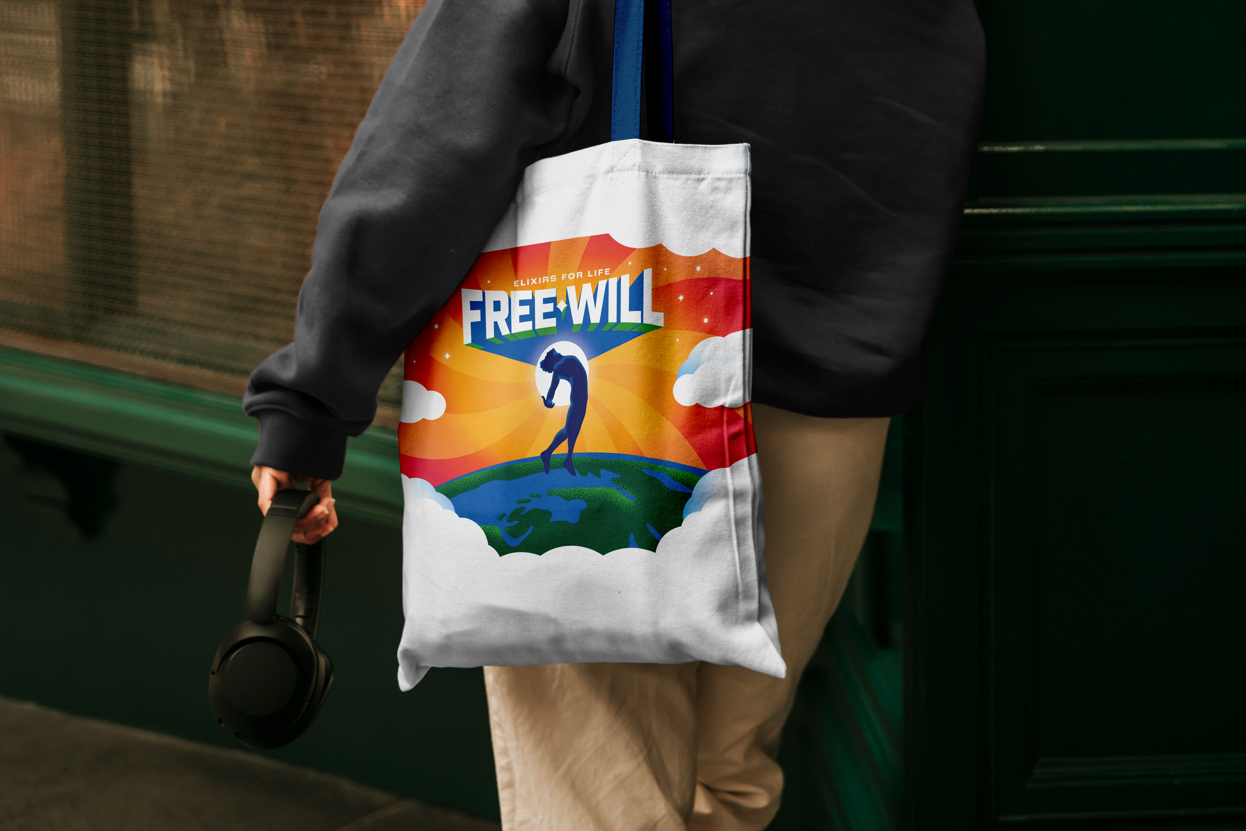
This lent itself to the continued development of other brand assets like cloud illustrations, star fields, sky gradients, and compositions with depth and atmosphere. These elements co-communicate the brand concept without using the hero illustration in every application.


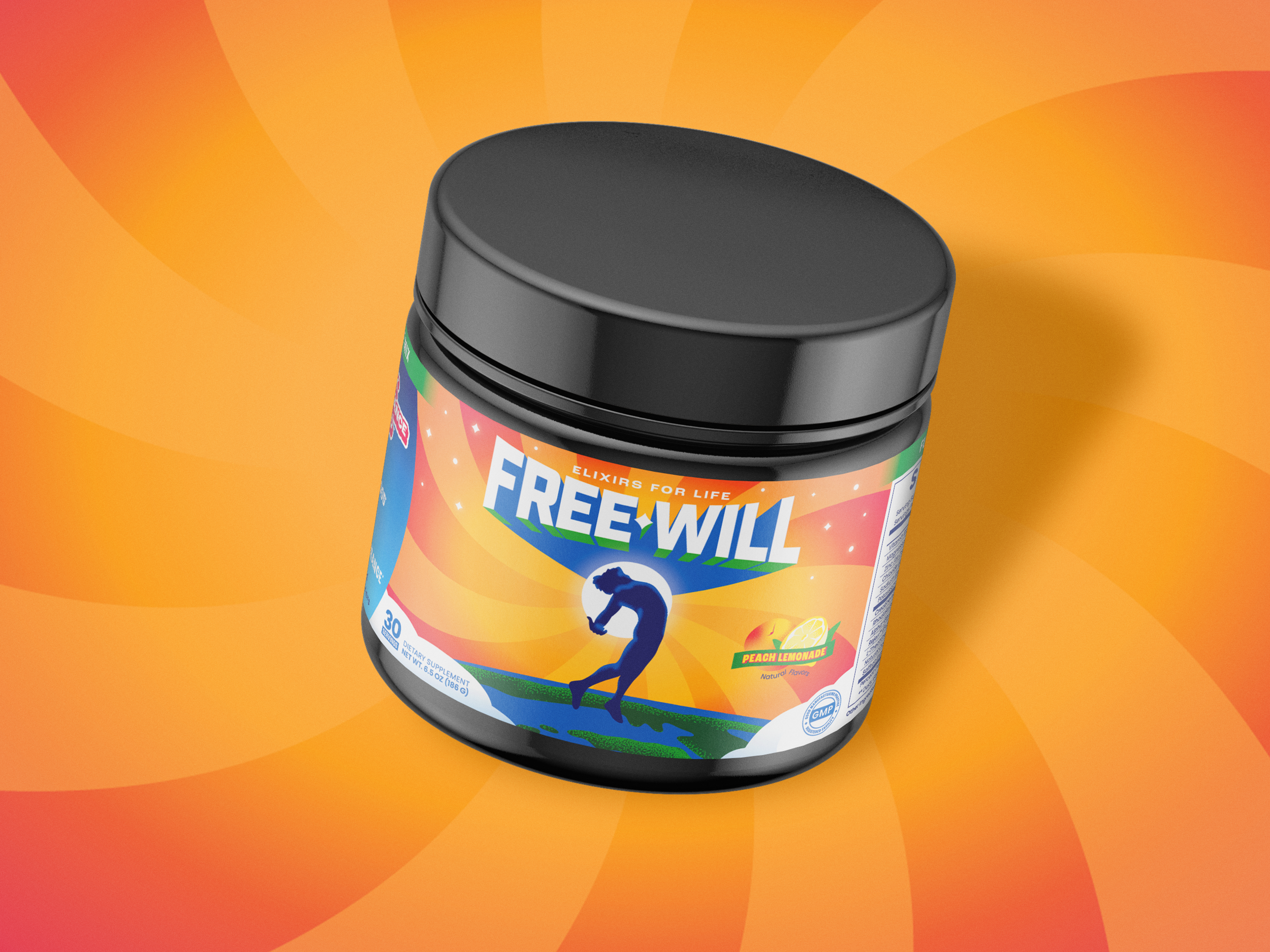
PACKAGING
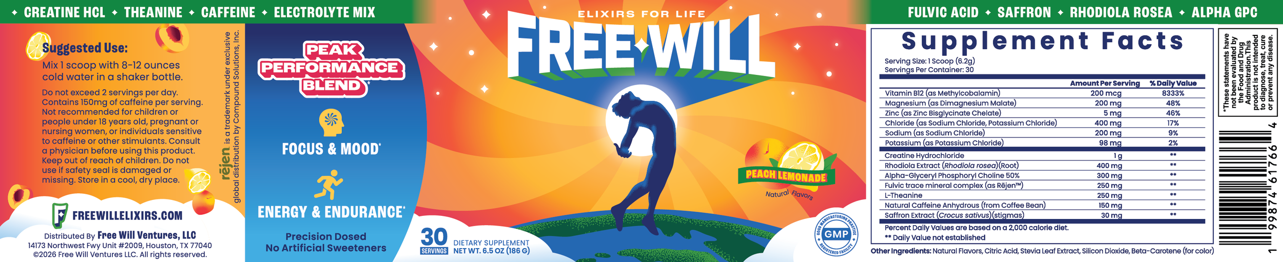
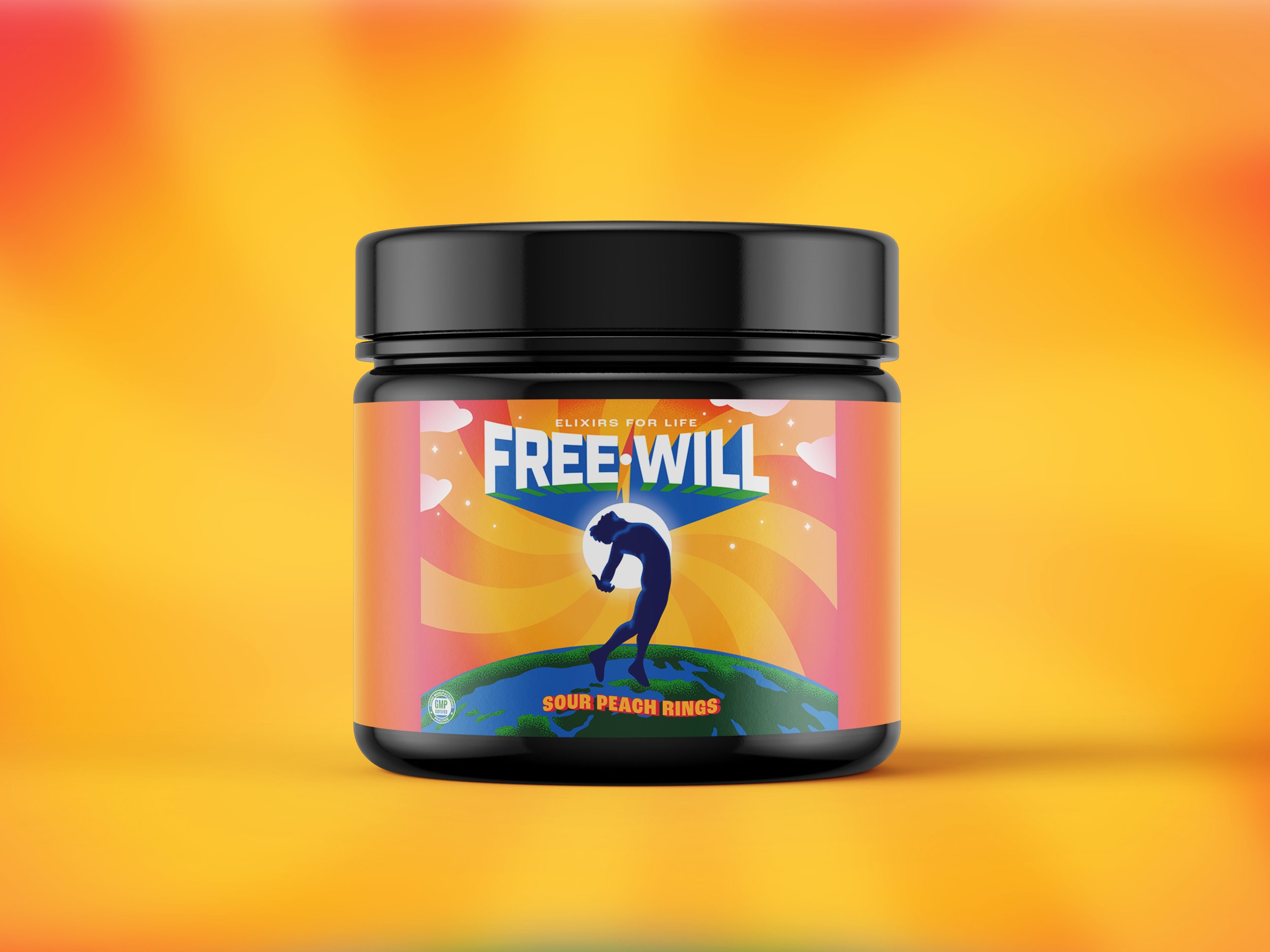
The final packaging…