THE EQUALIZER 3
TRAILER MOTION GRAPHIC DESIGN / MAIN TITLE TREATMENT / ANIMATIONAfter pitching rounds of graphic treatments with my team, the client chose my design as the established look for The Equalizer 3 campaign.
With the help of my Creative Director, Jeff Smith, I refined and animated the Main Title, end card, and internal text cards.
This design was used across theatrical trailers, television spots, and social media marketing.
design challenge
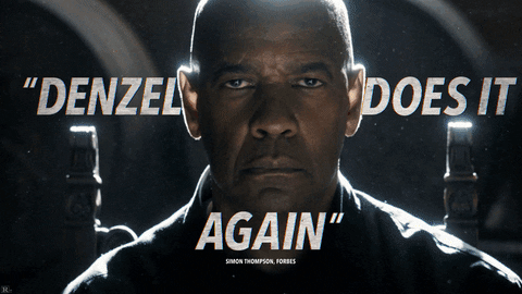
The creative brief called for a sophisticated, modern action look, with a subtle nod to the Italian locale, unique to this sequel.
My design incorporates an edgy modern typeface, rough stucco texture, and light smoky atmosphere. A select few of the cards are additionally riddled with bullet holes.

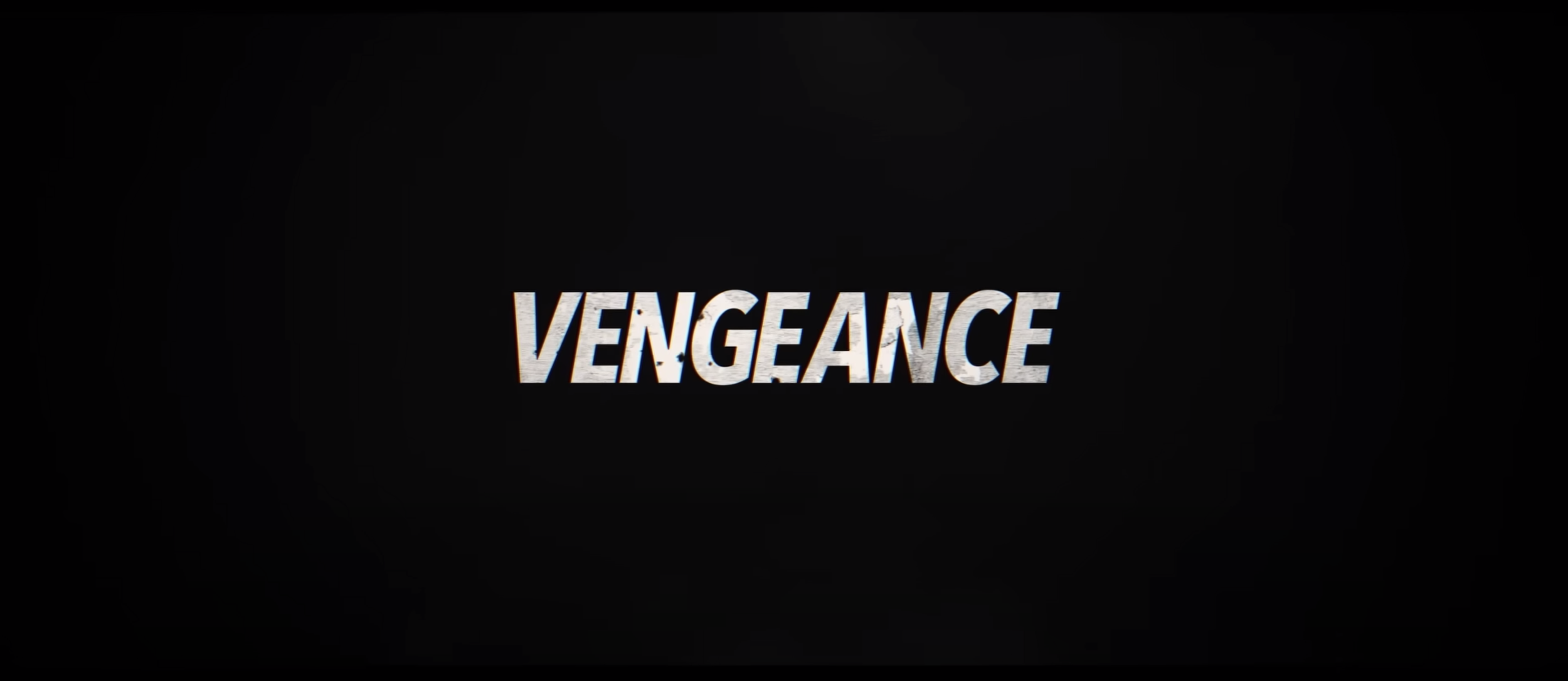


MAin TITLE
The typographic lockup for “The Equalizer” was client provided, based on the previous films. It was my task to stylize this MT and create a powerful lockup with a “3” to delineate the sequel.
For this individual look, I created the custom 3 by mirroring and skewing the E. Notice how the negative space between the E and 3 creates a brief equals sign as it animates.
CAMPAIGN EXTENSION
Although I did not work directly on many of the campaign’s assets beyond the main trailer, it was a joy to see my established design’s reach. I even found it implemented in the lyric video for the film’s end credits song.